What Happens When 150 People Try to Draw Famous Logos From Memory?
October 10, 2017 |
Ever since the 1956 publication of cognitive psychologist George A. Miller’s “The Magic Number Seven, Plus or Minus Two: Some Limits on Our Capacity for Processing Information,” short-term memory has proven a prominent topic in many areas. In advertising and marketing, where the powers that be often depend on quick connections to attract customers and clients, this is especially true. Long-term recollection definitely has its perks, too, among those who look to match their products and campaigns with impressionable end-users, and Signs.com recently crafted a masterstroke to explore such reflections, uniting 156 people to have them draw well-known logos. The results, along with producing some impressive attempts and, well, a few lackluster tries, helped the overseers reinforce branding’s reliance on color as a key marketing component.
The Salt Lake City-based collection of “sign, design and tech nerds” put individuals ranging from age 20 to 70 to the test in recalling the emblems of Adidas, Apple, Burger King, Domino’s, Foot Locker, IKEA, 7-Eleven, Starbucks, Walmart and Target. Through 80 hours of brainwork and handiwork, they dubbed their findings Branded in Memory, dividing the artistic representations into “more” and “less” accurate groups and providing percentage breakdowns of where people went wrong.

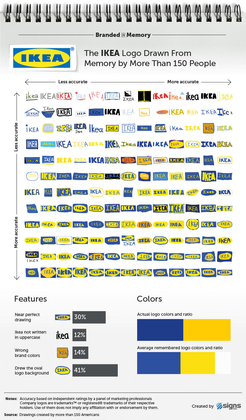
IKEA was the most successful of the included companies, with participants producing near-perfect and good drawings 86 percent of the time. (Image via signs.com)
Those findings are fascinating, especially when one looks at how often the participants used an old logo in their depictions. Tapping into long-term memory by choosing signifiers that “we see on a daily basis,” the Signs.com members determined that 53 percent of their subjects made “near perfect” and “good but not perfect” drawings and noted that a logo’s relative complexity made it a harder object to recapture, with IKEA generating the top scores and Starbucks needing a caffeine jolt in last place. On average, the younger set did better than older cohorts in terms of accuracy, but the overall group made the facilitators very happy thanks to its mastery of color patterns.
Around 80 percent of the would-be Vincent van Goghs and Frida Kahlos chose the proper hues for their renderings, leading color psychologist Karen Haller to offer: “People have an emotional connection with color first. Then we take in the shapes [and] the logo, and we read the words. If we sense a mismatch, it’s the color we don’t believe, despite the beautifully crafted words.”
I would certainly find myself among the nearly four-fifths of folks who remembered the right color composites, though I would be true to my lifelong inability to draw when pressed to press pen to paper. Regardless of the latter and definitely because of the former, I find this experiment very impressive. Where would you situate yourself among the participants with respect to knowing the color breakdowns? More importantly, what do you think having the majority of drawers constructing near-perfect and good-but-not-perfect recollections says about the power of contemplating and implementing standout logos for your brands?
