A Lesson in Logo Design From Google's Imperfect 'G'
November 28, 2017 |
The internet is a place at once empowering and stifling. It gives average people the platform to voice opinions, while also providing a veil of anonymity to those who choose to use it to target or discourage others. Often, it is those in the spotlight, such as celebrities and athletes, who find themselves at the mercy of these disparaging comments. Companies and corporations, however, also face intense scrutiny at all times, and though the internet can allow for valuable feedback from consumers, it is often the case that anonymous internet vigilantes hone in on perceived mistakes in order to shame or ridicule a brand.
Such was the case with Google, which recently faced criticism over a perceived flaw in the design of its “G” logo. After noticing that the logo was not a perfect circle, a user posted about the discovery on Reddit. While it is true that the “G” does not form a perfect circle, the Redditor failed to realize that the logo’s mathematical imperfection was in fact a part of its design.
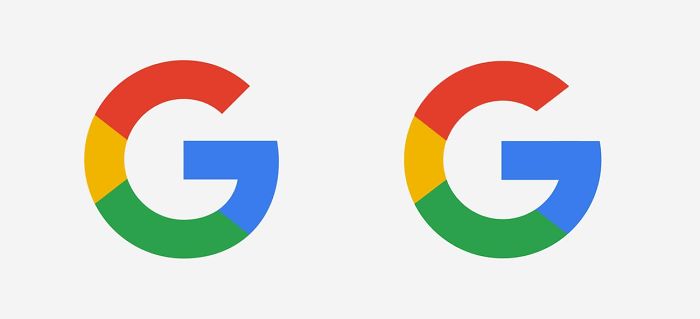
This fact was quickly stated by designers on the site’s r/graphic_design thread. While it may have seemed odd that Google would choose to make its logo mathematically imperfect, to a designer such a choice is known as optical balancing. In a side-by-side comparison between the optically balanced logo and one that has been altered to form a perfect circle, it is clear that the “imperfect” logo looks better. But why?

Look closely: Google’s logo (left) is not a perfect circle. The one on the right is, but looks uneven. | Credit: Bored Panda
The distinction has to do with human perception, which does not perceive objects as geometrically perfect, but rather estimates their shape. In the case the logo, which relies on quick recognition, a brief glance not only suggests a perfect circle, but also captures a memorable image optically designed through careful attention to shape and color. While mathematical perfection may be pleasing to some, it is more important for a logo to cater to the nuances of human perception in order to quickly and effectively reach the consumer. As one study has shown, shape is not even a leading factor in determining a logo’s memorability—rather, it is color that more closely interacts with human emotion, leading to greater entrenchment in memory.
Duly, the spectrum of colors used in Google’s “G” logo are arranged so as to aid eye-movement around the letter.
There are a few important lessons to be learned here, the first being that just because someone says something on the internet does not mean that it is true. In fact, Google acknowledged and provided an explanation for the imperfect geometrical design of the logo in a blog post in 2015.
The next (and perhaps most important) lesson to be learned is that the human brain is intricate, but imperfect. Not all we see is as it seems, to wax poetic (emphasis on the Poe—thanks for the inspiration, E.A.). A crucial element of design lies in its ability to manipulate these imperfections in human perception in order to create logos and images that make us happy, often inexplicably.
And so, in summation, just because something is “perfect” does not mean that it will be successful. Don’t believe me? Just ask these guys. Still skeptical? Try this. Catch my drift?
