Everyone Hates Formula 1 Racing's New Logo (But Here's What We Can Learn From It)
December 5, 2017 |
Formula One, the international single-seat auto-racing series, unveiled its new logo last week, and everyone hates it.
At least, everyone on Twitter:
F1's new logo is actually hideous. I thought that it was cut off. I get that it’s trying to show speed and movement, but nothing beats the old iconic logo. Really disappointed #f1 #f1logo #f1newlogo #scuderiaferarri #formulaone
— M I A ✤ R O S E (@thekryptikrose) November 27, 2017
With a few subtle changes, the new #F1logo becomes one that we can all enjoy. #LOL pic.twitter.com/QL7NmCLu0Y
— Late Brakers (@LateBrakers) November 27, 2017
Behind the scenes when the new F1 logo was being designed pic.twitter.com/1K49ETdD9o
— ? Dan Rigsby ? (@Dan_Rigsby) November 26, 2017
The F1 fanbase reacting to the new logo like pic.twitter.com/qrsEfR3nv0
— Motorsport Banter (@MSportBanter) November 26, 2017
Ouch.
Now, it’s important to remember that everyone hates everything on the internet, so cherry-picking a few angry tweets is not always a fair or reliable way to gauge public opinion. But in this case, the ratio of positive to negative reactions feels like 50 to one. Other than ESPN (whose endorsement is tepid at best) and a few graphic design nerds (we use that term endearingly), there aren’t many defenders of the new logo. Even the drivers hate it. Dang.
So, what went wrong? Many things. Here are a few—and some lessons businesses and organizations can learn from them.
In logo design, less is not always more
Logo design has been shifting toward minimalism for some time now, with brands large and small increasingly opting for a sleeker, more stripped-down look. Starbucks ditched its name and other accoutrements. Google scrapped the serifs (and put a lot of thought into the ‘G’.) And, heck, even McDonald’s is down to a simple, no-nonsense logo. Generally, it’s a good look.
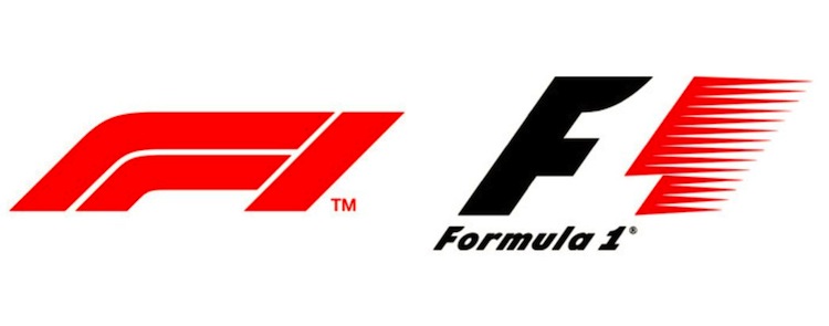
Formula One clearly tried to go this route. But in doing so, it lost some clever design elements that many fans had grown to love. Here’s the old logo one more time:
![]()
That’s a “1” there in the negative space, and it is, admittedly, very cool. And the whole logo suggests movement, thanks mainly to its 45-degree tilt and fiery red tailing edge. This logo looks fast.
The new logo kept the tilt, but did away with everything else—including the serifs on the “1,” which now looks more like the letter “I”. It’s sleek, sure, but to the point it’s almost nondescript. It had character before. Now, it’s mostly just forgettable—a cardinal sin of logo design.
Iterate, don’t abandon
Maybe the biggest gripe with Formula One’s new logo is that it is, well, entirely new. As seen above, it does away with the old logo entirely. This was probably the intent—Formula One recently underwent an ownership change, and the brand was likely looking to reinvent itself. Here’s a passage from the ESPN article mentioned earlier:
“In the 25-minute conference, spearheaded by F1’s managing director Sean Bratches—part of the new triumvirate which replaced [former owner and CEO Bernie] Ecclestone—and new marketing director Ellie Norman, the word “digital” was said ten times, while the word “brand” hit 24 mentions. It’s hard to imagine the former, especially, being a popular go-to phrase in an Ecclestone media scrum (his preferred way of talking to the media) about the future of Formula One.
Digital considerations were a big motivator in Liberty creating a new logo and one of the main areas the American media company has already differentiated itself from the way Ecclestone ran F1 during his long time in charge.”
That sounds an awful lot like the new regime trying to distance itself from the old as much as possible. This makes sense for the brand—going more digital-friendly is a smart move for a legacy sport—but it’s understandable why the move irked long-time fans. The new logo is a symbolic departure from everything those fans know and love about Formula One. It strips away decades of identity, asking fans for blind faith in the future without anything to anchor them to the past. That’s a dangerous gamble.
Formula One site The F1 Broadcasting Blog summed it up nicely:
Last tweet on the @F1 logo. Notice how other brands have iterated rather than ripped up their existing branding. This feels like an attempt to detatch F1 from the 'Bernie-era'. pic.twitter.com/sGntXDr7Dr
— Motorsport Broadcasting (@f1broadcasting) November 26, 2017
Know your audience
We keep coming back to this, and for good reason. Here’s a Twitter poll from another Formula One site, Lights Out F1 Blog:
New #F1 logo to be revealed on Sunday. Does it need changing?
— Lights Out ●●●●● (@LightsOutF1Blog) November 24, 2017
This is far from a scientific poll, but 328 votes is a decent sample size. And it’s reasonable to assume the respondents here are diehard fans—they follow a dedicated Formula One blog on Twitter, for crying out loud. These people voted overwhelmingly against a logo change, and that was before Formula One unveiled the new logo.
There may be some confirmation bias in play here—fans already hated the logo before they even saw it. But this simple poll and the majority of the Twitter reactions indicate that no one wanted a logo change. Formula One fans liked the old logo just fine. Changing the logo may be the right long-term move for the brand, especially if it wants to capture new audience. But it could have been done in in a way that stayed true to the sport’s (and the original logo’s) heritage.
Oh, hey, here’s another vaunted auto-racing brand that did just that:
Another racing series also changed their logo earlier this year. pic.twitter.com/GPuZS4delT
— Kevin (@DeKevinWalsh) November 26, 2017
And here’s what NASCAR chief marketing officer said about the logo design, via The Sporting News:
“Our new NASCAR mark is modern, timeless and embraces the heritage of our sport. It was important for us to recognize our history and implement a piece of each previous mark in the new design. Our goal was to evolve the sport’s visual identity to make it concise, relevant and functional, while respecting and maintaining the unique qualities of the original mark.”
Compare that to what Formula One managing director Sean Bratches said about his sport’s new logo, via ESPN:
“We are trying to reposition Formula One from a purely motorsport company to a media and entertainment brand with the heart and soul of a race car driver in the middle of it.”
One of those logo changes earned headlines like “NASCAR’s New Logo Pays Homage to Series’ Rich History.” The other earned a Twitter-storm of chimpanzee gifs. Consider which of those sides you want to be on when working on logo design or redesign projects, or refreshing your brand’s identity.
It’s probably not the one with the chimpanzees.