The 10 Best Company Logos of All Time
April 11, 2017 |
We all know the day-to-day operations it takes to make a business successful—copious office supplies, happy employees, enterprising goals, good coffee, etc. But, there’s another element to any business that can propel or sink a company in an instant: the logo.
For branded products, your logo needs to be eye-catching in order to increase brand awareness, and eventually, gain new customers. If you’re looking to revamp your look ahead of a promotional campaign, here’s some logo inspiration that might get the wheels turning.
Check out the 10 best company logos below.
1. Nike
(Image via Wikipedia)
Nike’s Swoosh logo design is one of the most recognizable logos in the world. Meant to symbolize motion and the wing of Nike, the Greek goddess of victory, it perfectly encapsulates the brand’s message, and it sticks in consumers’ minds.
2. Apple
(Image via Wikimedia Commons)
There are conflicting stories behind the meaning of Apple’s logo. Some say it’s a tribute to Alan Turing, the man who pioneered research that contributed to the modern-day computer. Others have said it’s a nod to Adam and Eve, or even Sir Isaac Newton. Either way, the Apple design has transformed throughout the years, but it’s ubiquity remains the same.
3. McDonald’s
(Image via Wikimedia Commons)
McDonald’s golden arches are as synonymous with the brand as the McNugget. Before the logo came to be, it was initially an architectural sketch. Then, the real arches became a part of the restaurant design, and subsequently, a part of the company’s rebranded logo. And the rest is history.
4. Coca-Cola
(Image via Wikimedia Commons)
The Coca-Cola logo has an interesting backstory because the name, itself, was created in an attempt to achieve a perfect logo. Frank M. Robinson, the company’s bookkeeper, proposed the name because the two C’s would look nice in advertising. Looks like he was right about that.
5. Target

(Image via Wikimedia Commons)
Target’s logo was unveiled in 1962 after deliberating on more than 200 possible names and logo designs. Eventually, they decided on Target for the name, and the bullseye logo design came quickly after that.
6. Amazon
(Image via Business Insider)
There are some hidden symbols in Amazon’s logo, which makes it both eye-catching and memorable. The yellow arrow represents a smile, as well as a link from A to Z.
7. Starbucks
(Image via Wikipedia)
After reading “Moby Dick,” the founder of Starbucks had his nautical inspiration for his budding company’s logo. After looking through old books for images of sirens, sprites, water nymphs and mermaids, graphic designer Terry Heckler came up with the first renderings of the mermaid logo.
8. FedEx
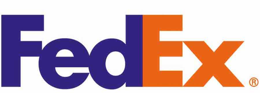
(Image via Crowdspring)
The FedEx logo is another example of a logo with a hidden meaning. This particular logo design was created in 1994, and features an arrow optical illusion hidden in the last two letters. Thus, the brand’s message is on target and the logo sticks in customers’ minds.
9. BMW
(Image via Logoblink.com)
The BMW logo gained extra attention because of a false backstory. Many consumers believed the design represented an airline propellor, but actually, it’s just meant to symbolize the Bavarian flag. Either way, this symbol remains representative of luxury.
10. World Wildlife Fund
(Image via Wikipedia)
The inspiration for the WWF logo traces back to Chi-Chi, a giant panda living in the London Zoo in 1961—the same year WWF came to be. The founders agreed that the giant panda would appeal to all nationalities and become a recognizable symbol of the nonprofit’s cause.